
02Landing Page2026Solo — concept, design, build, tests
Obrys — Renovation Studio Site
A site for a renovation studio built around one interaction: drag the divider across a photo and the room turns from what it was into what it became.
Private repo

The problem
A renovation studio sells one thing: the difference between the room you have and the room you get. Most of their sites show that difference as two photos side by side, shrunk until neither is worth looking at. One photo with a divider you drag says it better — but only if the drag feels like moving a sheet of paper rather than waiting for a browser. That had to hold on a phone, where the same finger might be trying to scroll the page, and on a page carrying seven of these sliders at once.
Decisions
01
The drag moves layers, not pixels
The after-photo sits in a clipping layer shifted right by the divider, with the photo inside shifted left by the same amount, so it stays put while its visible edge moves. Three transforms change and nothing repaints. The layers are promoted only while a slider is in use, so a page of seven does not hold GPU memory for the idle ones. An end-to-end test proves it: a Chrome trace of a thirty-step drag records zero paint events, and a control run with the promotion switched off records one per frame — otherwise the zero would only mean the test cannot see paints.
02
A finger that might be scrolling
The first touch test failed and was right to. A browser sends the first few pointer moves before it decides a vertical swipe belongs to the page, so the divider jumped to wherever the finger landed and then the page scrolled away underneath it. Now the divider waits for eight pixels of clearly sideways movement; a vertical swipe scrolls and leaves it alone, and a tap without travel still jumps, the way a click does. The rule is a pure function with its own unit tests, and real touch events through the DevTools protocol check it in the browser.
03
JavaScript only where it earns its place
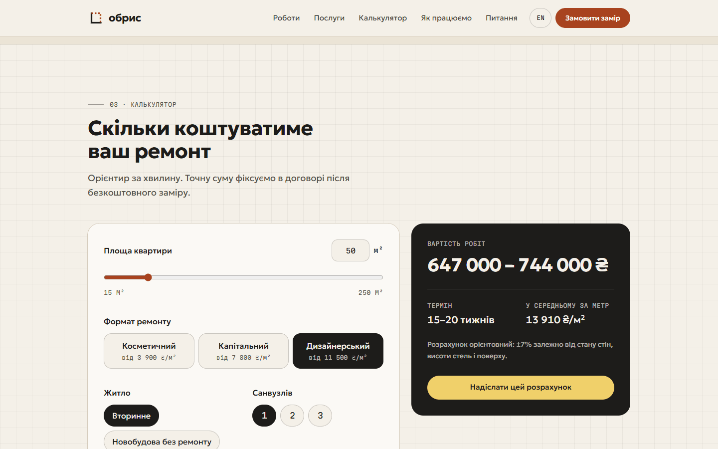
The work gallery filters with radio buttons and CSS :has(), so it works with scripts off — a test runs that page with JavaScript disabled to keep it honest. The price calculator renders its first estimate on the server from the same pricing function the browser then reuses, and unit tests check that the printed price cards and the calculator can never contradict each other. What ships is 4.3 KB of JavaScript, gzipped, for the slider, the calculator, the request form and the menu together.
04
Fonts that do not move the page
Ukrainian text needs both font subsets: the letters come from the Cyrillic file, the spaces and digits from the Latin one, and preloading only the first let the heading lose a whole line when the second arrived. The fallback Astro generates for a variable font is measured on its thin default instance and has no bold face, so bold headings rendered as plain Arial until the swap; two hand-written metric-matched faces replaced it. On phones the slider sits above the heading, so no reflow above it can push it down. With the font held back 800 ms on purpose, the worst layout shift across eighteen width and language combinations is 0.023.
05
Switching a plan should feel like switching
Picking another price card used to swap the numbers instantly, which read as nothing happening. The totals now roll to the new figure over 420 ms, the chosen plan lights up for a second, and the filled button follows whichever card the pointer or the keyboard is on. While the area slider is being dragged the numbers follow it exactly instead, because a lag there is just lag. Reduced motion turns all of it off, and a screen reader hears the result once the numbers settle rather than on every frame.
06
Drawn stand-ins until real pairs exist
The before and after pictures are drawn in code, the same room twice with identical geometry, and the studio, its projects and its reviews are made up — the footer says so. A real pair has to be shot from exactly the same spot, and the slider is merciless about that: any drift shows as a jump at the divider.
What I measured
4.3 KB
JavaScript on the page
gzipped — slider, calculator, form and menu together
0
paints during a drag
from a Chrome trace; the control run records one per frame
98 / 100
Lighthouse mobile / desktop
on the live site, with no layout shift in either
50 + 28
unit + end-to-end tests
Chrome and an emulated Pixel 7, touch gestures included


Built with
- Astro
- TypeScript
- Tailwind CSS
- Playwright
- Cloudflare Workers